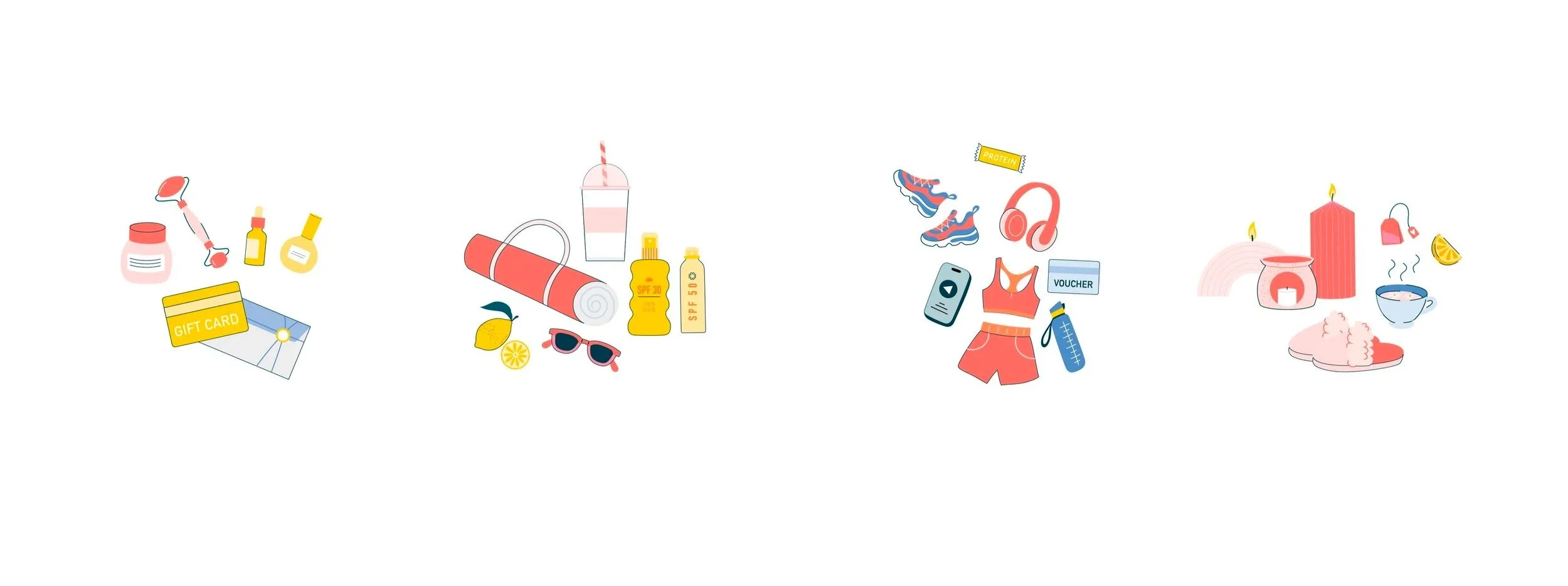
National Dental Care Refer a Friend illustration
Client: National Dental Care. This project was done as part of my work at Creatik.
The National Dental Care was relaunching their Refer A Friend program, with the goal of the new campaign being more engaging, more authentic and more fun than their current one that was often gone unnoticed. The team at Creatik was briefed to design of a hero illustration to give the initiative a recognisable look that speaks to the right audience. The new initiative was also to introduce a wellness centred approach, with a seasonal side to it as well, which would be reflected through the reward prices. The challenge of the brief was showcasing all of this in a single hero illustration, that worked well both in small and large scale.
We started by exploring different illustration styles that would speak to the intended audience: Mums, who seem to be doing the booking more often than not. The challenge was creating a style that wasn’t too childish, too corporate and clinical and was detailed enough to describe the specific awards, like a Mecca voucher or a self care kit.


We landed on a moderately detailed style that combines an outlined approached with solid colour, giving us the opportunity to clearly visualise these prices and to add detail and texture. We also looked at different ways of illustrating the prices. Rather than showing individual objects, our aim was to connect to the positive feelings and moments these prices would bring.
The overall composition and how to bring all this together also required careful consideration. The main colour, teal, was only used for the gift box to connect back to the brand and the initiative. Our goal was a box that felt full, without it feeling chaotic or messy. Something that would be flexible in terms of its use when it comes to things like background colour and viewing the illustration in a smaller size.


The finished illustration works well as part of the NDC brand, whilst adding that feeling of something new we were after. It has a mature but fun feel to it and it feels clean without feeling clinical or overly corporate, resonating with the right audience.


